¶ Basic Navigation
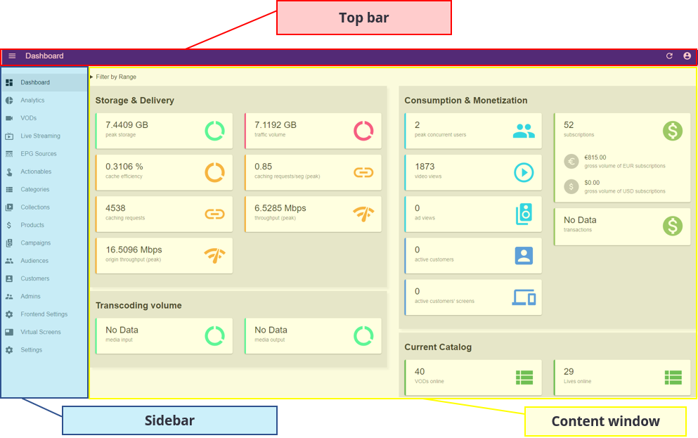
In general, Vizzi’s backoffice UI is divided into 3 main sections:

- Top bar: shows the currently displayed page title, providing an easy way to determine user context at each given moment. It also enables the user to refresh the contents and access the user profile, preferences and logout functions;
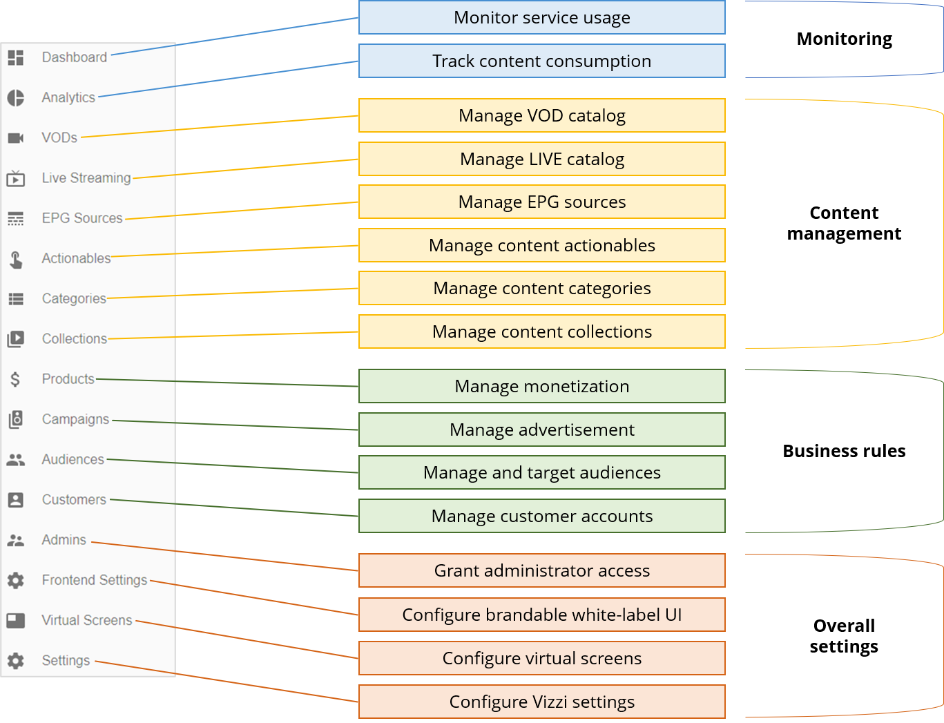
- Sidebar: provides navigation between Vizzi profile settings, enabling the user to quickly navigate from one settings tab to another;
- Content window: displays content and settings for the selected context. All the Configuration and analysis actions are performed in this area.
¶ Top Bar
The top bar is arranged as follows:

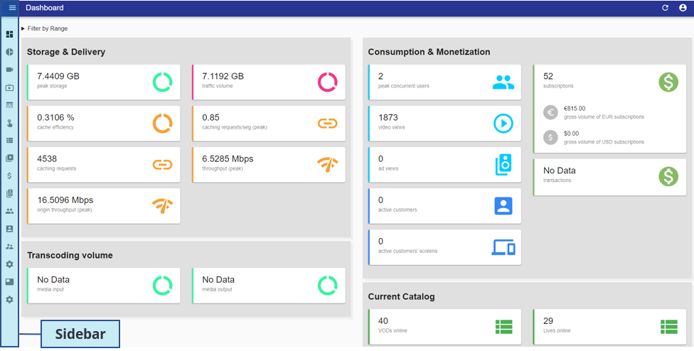
- Collapse button: by clicking on this button the sidebar will be minimized to improve the visualization area of the Content window (see image below):

- Title: shows the title of the page in which the user is currently in;
- Refresh button: clicking in this button will refresh the page contents;
- Profile button: provides quick access to user profile, preferences and logout functions. When clicking in this button you will be able to access;
- User Settings: user preferences for the backoffice UI;

- Visual configurations: choosing between "LIGHT" (default) or "DARK" theme;
- Language configurations: choosing back-office display language (currently available: Portuguese, English, Spanish and French).
- Logout: clicking "Logout" will disconnect your session in the back-office.
- User Settings: user preferences for the backoffice UI;
¶ Sidebar
Provides navigation between Vizzi profile settings, enabling the user to quickly navigate from one settings tab to another.

¶ Content Window
The content window is where you will find most of the information you need.
It will generally take one of two forms, being either a free form display (Dashboard, Analytics and Settings) or a list form display (VODs, Live Streaming, EPG Sources, Actionables, Categories, Collections, Products, Campaigns, Audiences, Customers, Admins, Frontend Settings and Virtual Screens).
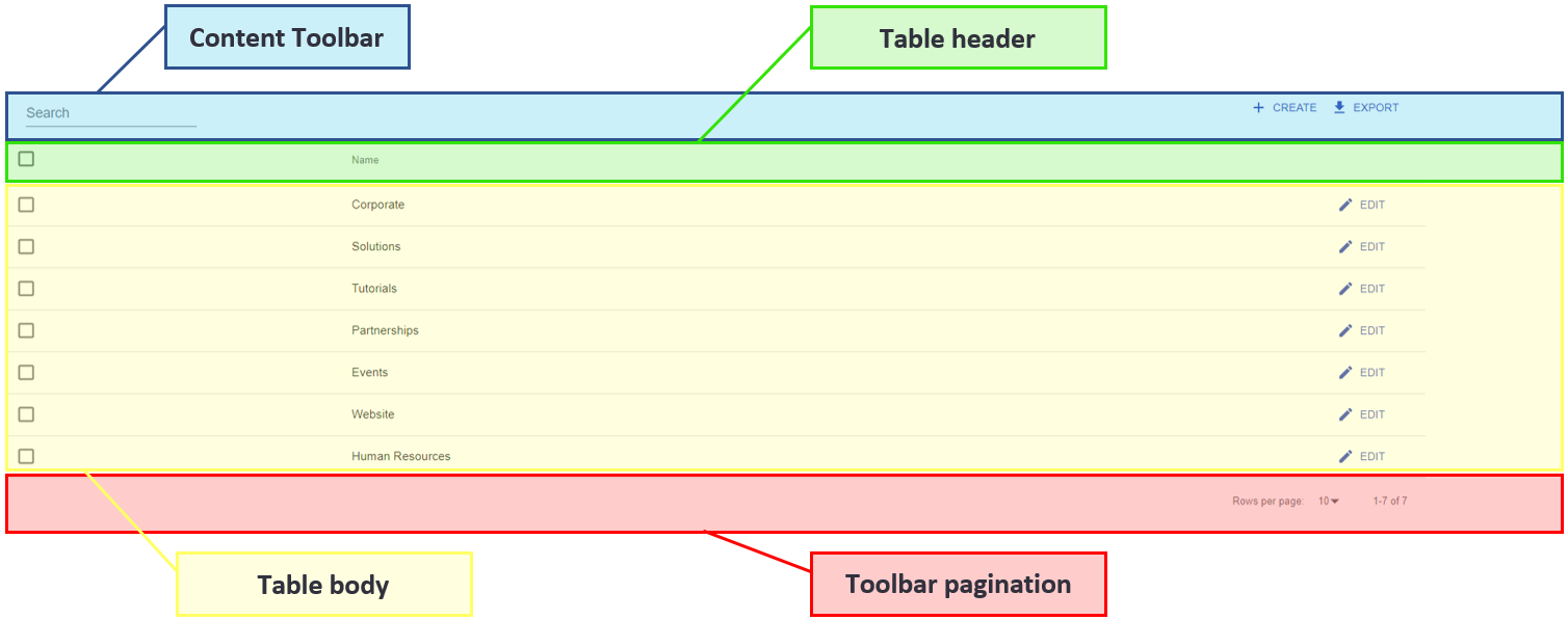
For list form display we can divide the content window into four parts as depicted below, more detail will be given in the following chapters.

List form display arrangement (see image above) has several controls & functions that are similar between different modules, this eases user interaction making it simpler to operate.
Next, we will explain the controls & functions that are common to the modules EPG Sources, Categories, Campaigns, Audiences, Customers, Admins and Frontend Settings.
¶ Content Toolbar
The upper bar contains the tools to control and manage all the items portrayed in the list.

- Search: enter a text to search for items by name, description, email or title. The fields searched will vary by modules;
Note: the text search will remain active until the text is deleted.
- CREATE: click to open the form for creating a new item. This option will appear in all modules;
- EXPORT: allows you to export information from all the items in the list into a “.csv” file. This option will appear in all modules.
¶ Table Header
Presents the checkbox to select all the items at once (left) and displays titles for each column of the items table (right).

- Check select all: clicking on this checkbox will select all items at once;
- Content columns: contains the column headings of the table. Varies from module to module.
¶ Table Body
Presents the check box to select a single item (left), the item details organized by column (middle) and quick action buttons (right).

- Check select item: by clicking on the check select item in a table row, the corresponding item will be marked for bulk actions and the “Bulk Actions” menu will be displayed. See chapter “Bulk Actions”;
- Content columns: summary of item details organized by column for each item (one item per row). Varies from module to module;
- Quick actions: quick action buttons granting easily accessible operations over each item.
a. Edit: default action available on all items, allows you to edit the item clicked.
Some modules present additional action buttons, these are described in each module chapter (e.g. Live Streaming).
¶ Bulk Actions
Bulk actions are made available when one or multiple items are selected at once.
Each time one or more items are selected the “Bulk Actions” menu will be displayed on top of the list component, presenting the set of actions that can be applied to multiple selected items at once.

- Delete: the default bulk action is available on all items and allows to delete the selected items.
Some of the modules will present additional bulk action buttons, these are described in each module chapter (see VODs, Live Streaming and Collections).
¶ Toolbar Pagination
The toolbar pagination allows you to choose how many items will be displayed per page, and to navigate between pages.

- Pagination select: choose the number of items you want to display per page (5, 10 or 25);
- Pagination caption: indicates which items you are viewing from the total of existing items;
- Previous button: by clicking you will navigate to the previous items page;
- Number button: shows quick links for adjacent pages, clicking on any of these links will show the corresponding page;
- Next button: by clicking on this button you will be redirected to the next page of items.